
Rebrands that worked, some that didn’t and a couple that just might.
There have been several high-profile rebrands in recent years, and some have, of course, been more successful than others. It’s not easy to discard a design and personality that worked in favor of a new one, regardless of how much research, creativity and innovation goes into the effort.
Imagine if you began to feel like your friends were getting bored with you. They seem to be hanging out with other people more often. You might try to improve your image and make yourself a more attractive companion, but there’s a fine line between meaningful improvement and desperately grasping for attention.
Beauty is in the eye of the beholder, so what seems great to one person may not be so great for another. When the change happens with multi-billion dollar corporations, there’s a lot riding on whether the public accepts the change or rejects it.
Let’s look at a couple of major rebrands that worked.
APPLE – 1997
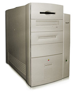
In 2020, Apple is one of the brands currently enjoying its share of world domination through its iPhone, iWatch, iPad, iTunes, App Store, AppleTV… and oh yeah, its Macintosh computers. However up til the 90’s Apple Computer was largely considered a niche brand for kids, schools and artists.
Their beige cabinets looked like every other P.C. on the market, but their Operating System wasn’t compatible with software written for Microsoft’s Windows, which owned some 95% of total market share.
In 1997, the company welcomed co-founder Steve Jobs back into the fold, hungry for some visionary leadership. The next few years would be revolutionary for the computer industry, and heralded a major change in lifestyle for billions of people all over the globe.
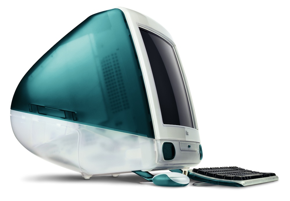
in 1998 The original iMac was released. The revolutionary round design in translucent Bondi Blue was an instant success, and changed the trajectory of Apple, and the computer industry, forever. The color and form factor were clearly meant for home users, not “power users.” This made the home computer not just undaunting, but appealing. They even kept it friendly with the “Say Hello to iMac” slogan.
The logo changed as well, and kept changing over the years to match the latest product themes, signifying Apple’s continual innovation and progress.
Apple’s “Think Different” campaign encouraged customers to see Apple products as an expression of free-spirited individuality. The easy and approachable brand image Apple had achieved opened the possibility for products like the iPod, iPhone, iPad etc. These products were geared toward consumers to make technology not just easy, but also fashionable.
IHOP 2015
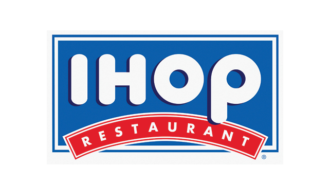
The International House of Pancakes has been around for decades, and is well known as an casual, affordable breakfast spot for families and friends. It enjoyed steady success, but sales were declining, so in 2015 IHOP decided it was time to freshen thing up. Although most patrons never saw it this way, IHOP’s vice president said the previous logo resembled a frowning face. They wanted to reverse that negative attitude, so they did exactly that by turning the logo into a happy face.
The font and colors remain—it’s hard to argue with red and blue. Simple, primary colors may not necessarily be distinctive, but they’re easy to swallow, especially for young kids—reinforcing IHOP’s family-friendly atmosphere.
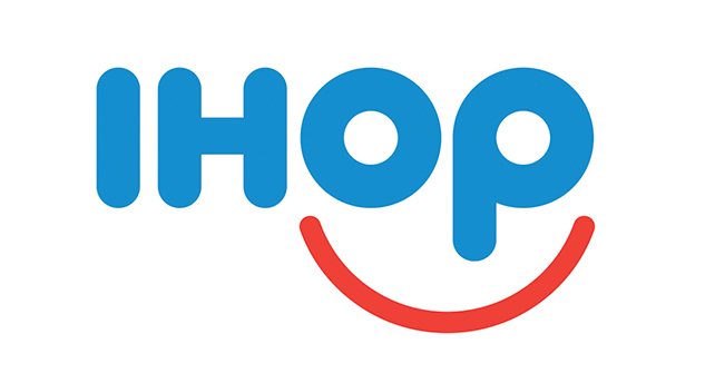
IHOP removed the rectangle and banner for a more free feeling, and you’d probably agree that the smiling face, once you see it, is infectious. It encourages a positive attitude and good cheer, which is what you want to experience at any family restaurant, especially for the first meal of the day. As long as you’re not creeped out by clowns, this logo probably puts you at ease.
IHOP also briefly toyed with flipping the P into a B to temporarily become the International House of Burgers. There is much disagreement over whether it was a good idea, but their burger sales certainly went up. It didn’t stick, so perhaps it was simply a marketing stunt after all, but for an establishment known for breakfast, it may have been an ingenious way of increasing their lunch and dinner crowds.
And now some rebrands that didn’t work.
AOL – 2009
AOL was the gateway to this newfangled thingy called the internet for many families and individuals back in the 90’s. It may seem like insanity now, but the sound of the dial-up modem making its bizarre robot sounds while it connected you to the world wide web was exhilarating back in the early days of home internet access. But, the novelty wore off as people became more net-savvy, and learned that they didn’t actually need an Online Service to access the web. Broadband Internet Service Providers were bundling internet with TV and Phone service, and you didn’t even need to “sign on.” AOL was stuck with an image as the internet’s training wheels where its competition was all about free-wheeling innovation.
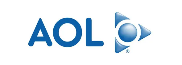
After a decline in relevance and popularity, America On Line found itself spinning off from Time Warner and presented a sweeping rebrand to begin its life anew once more. The result was a change from a look that had personality into a bland, uninspired wordmark. It inexplicably de-capitalized the initials for “On Line” to leave what had been recognizable as an acronym looking like some weird Dungeons & Dragons spelling of “Owl.”
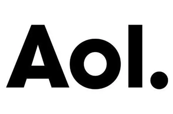
The period in the logo was added to suggest “confidence, completeness. AOL is the place to go for the best content online, period.” Unfortunately, it came across more like a confusing sentence fragment lacking any clear meaning. It also complicated any press that would be written about it, by forcing in a period where one wouldn’t belong.
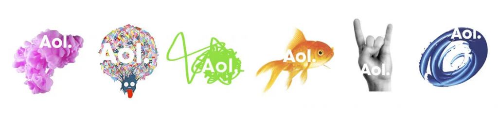
Rather than design a new logo that captured or even suggested the breadth of AOL’s content, the logotype was placed atop hundreds of backgrounds. This results in a logo that has no expression of its own, but instead relies on art and photography. It’s unable to tell its own story through its own design.
The rebranding could also have been an opportunity to recognize that their own name “America On Line” missed the whole point of the “World Wide Web.”
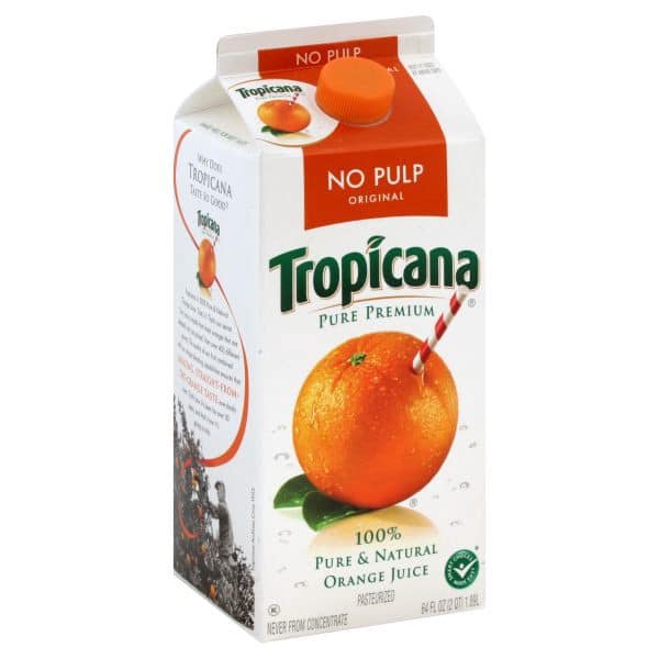
Tropicana – 2008
Tropicana is certainly best known for their orange juice, but they have grown into a major beverage brand with a wide variety of products on the market. in 2009, they decided it was time for a rebrand, complete with a new logo and new packaging designs.
For a decade or more now, brands have been moving to a more minimalist look—less busy and less ornamented in their logos and designs. Tropicana tried this as well, however, the result was not a success.
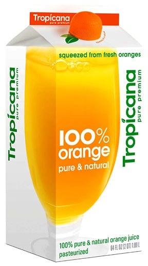
At a glance, it looks alright: clean, easy to read, and clear about what the product is; but the problem was brand recognition. Shoppers had trouble identifying the cartons as Tropicana products, and—since many people don’t look closely at packaging—they passed them over as off-brand knock-offs in favor of known brands like Florida Natural, which—perhaps ironically—looked more like a Tropicana product than Tropicana’s own new design.
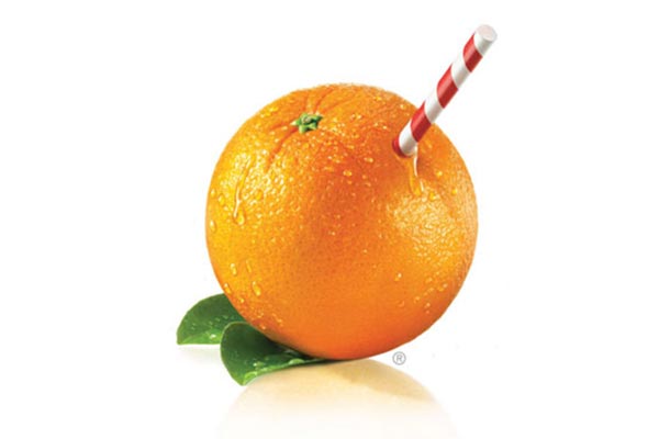
Tropicana enjoyed great brand recognition and loyalty it had developed over many years. Their iconic orange with a straw image along with the arced logo grabbed attention, and were successfully programmed into consumers’ minds. The new designs did away with both recognizable elements in favor of something else.
That’s all you could really say about it was that it was… something else. Not better, not very attractive, somewhat generic, a glass of orange juice, and a new logo type that not only lacked personality, but also made readability challenging by rotating it 90 degrees, and using a smaller font size. This diminished the appearance of the logo in comparison to the “100% orange” type that now became the dominant text element in the design.
This is an example of a company itching for a rebrand, where its customers apparently were not. The redesign wasn’t ugly, but it discarded inspired and successful design in favor of bland design and questionable layout choices. It should come as no surprise that Tropicana abandoned the rebrand after sales dropped sharply. However, if you look at Tropicana’s other products on the shelves today, you’ll still see elements of the rebrand effort in use, perhaps since there’s less confusion among their non-orange product line.
Here are a couple of rebrands whose success or failure has yet to be seen.
SUBWAY – 2016
Subway got some REALLY BAD PRESS when their spokesman ran into some much-publicized trouble with the law.

Subway is a large chain with restaurants all over the world, so it probably could have weathered the storm with some damage-control. However, sales were slipping with fierce competition from a growing list of brands offering freshly made meals, so with the future of the company hanging in the balance, it was a good time to make a change and break from the past.
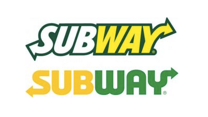
Just in time for the Olympics, Subway unveiled a new logo that was fresh (pun intended) and modern. The color scheme changed slightly, and the logo font was new, while the arrows remained. Along with the automatic benefit of looking diferent and leaving the branding of the Jared Fogle ads in the past, it also enabled a monogram version of the logo—although at least one tweet likened it to a recycling logo.

Unfortunately, the chain has closed over a thousand stores, so the jury’s out as to whether this rebrand will be a success or not. They may ultimately fall victim to “stuck in the middle syndrome.” Subway is a large chain that wants to be known for fresh ingredients and healthy menu selections, but quality and freshness are not often associated with large chain restaurants, and consumers probably see Subway as fast-food on-par with McDonald’s, placing volume above quality.
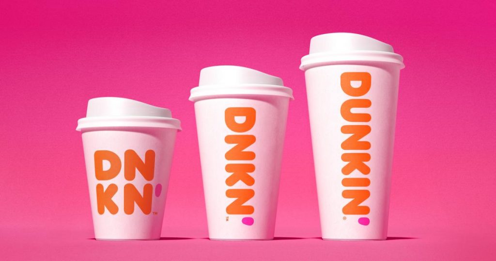
DUNKIN’ – 2019
Dunkin’ Donuts is ubiquitous particularly in the eastern United States, and a major competitor to Starbucks with over 12,000 stores worldwide. The brand has undergone changes over the decades, but in recent years Dunkin’ Donuts apparently became aware that customers often referred to the restaurant chain as simply “Dunks” or “Dunkin.” They even began using the shorter moniker in their advertising, “America Runs on Dunkin.”
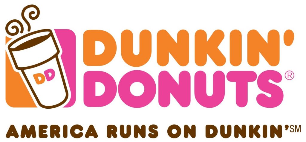
Recently they’ve begun rebranding as simply “Dunkin'” even going so far as to abbreviate to just DNKN in some brand elements (which just happens to be their stock ticker symbol). This change would seem to reflect a transition from merely a donut company to a more diverse provider of coffee and other refreshments. They kept the modern colors and font, but shortened the name.
Tony Weisman, Chief Marketing Officer of Dunkin’ U.S. said “We are bringing the iconic name Dunkin’ to the forefront in a bold way that brings to life how we refill optimism with each cup and bring fun, joy and delight to our customers each and every day.”
Will it work? I think so. We’ll have to wait and see, but really they just dropped a generic word off the company name and logo. Much like Apple dropped “Computer” off their name and opened the possibilities for music, phones and more, Dunkin’ wishes to broaden their horizons while preserving brand recognition. Millions of customers already call it simply “Dunkin'” anyway, so it will probably work out just fine. Dunkin’ doesn’t have to worry about customers failing to recognize them in a sea of competition, since most customer probably go to the same few brick-and-mortar stores frequently. A missing word shouldn’t cause them any confusion.
Conclusion
Hindsight, they say, is always 20/20. It’s very easy to look back and see why something worked and why something else didn’t. It’s monumentally difficult to foresee how multitudes of people will react to a change in branding. Splitting that arrow may simply be impossible. Sometimes it’s welcomed warmly, and other times it’s rejected ferociously. Sometimes you get a Sammy Hagar, and sometimes you get a Gary Cherone. Marketers and designers spend thousands of hours and millions of dollars trying to get it right, but sometimes you just can’t know what people are going to think. The blue iMac could have been a huge disaster and sunk the company, and we could all have found ourselves with the Zune as our most vital, can’t-live-without-it device. Well, sometimes things just have a way of working out for the best.